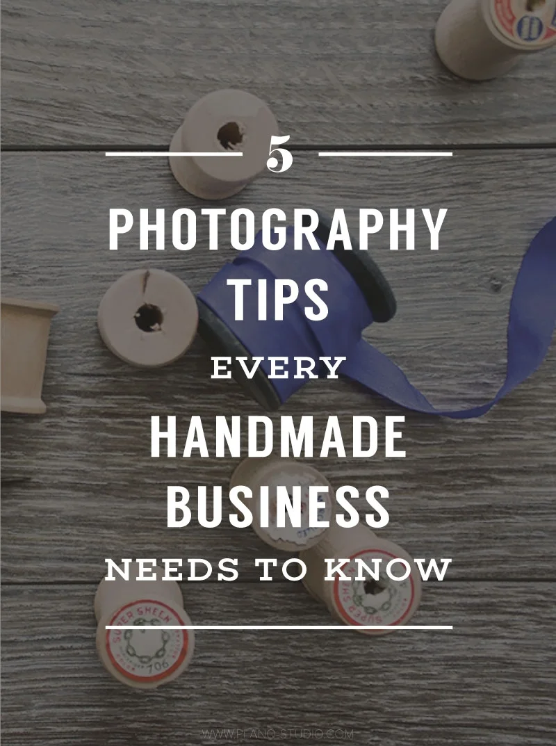
My Brand Photography Process
/
When I first ventured into the world of blogging, my visual materials were all over the place. My fonts were inconsistent because I didn't know which ones to choose. I was trying them all, which made my images look disconnected. I didn't know what my style was so I created images that looked nothing alike. And let's not even talk about my colors! Oh, I shudder to think about how awful my early photos were. I don't think anyone could point at any of my photographs and say, "Oh, that's M's work." Looking back on it, neither do I want them to.
The light at the end of the tunnel is that I finally figured it all out. I learned about branding and I found my style. All those early photo fails really taught me what I liked and didn't like, so I guess there was some good that came out of it in those early days. Because of the struggles I went through in the beginning, I became a firm believer that everyone should have a cohesive brand for their business (yes, even if you're "just" a blogger!).
Having a solid brand has really taken the stress out of all the work for me. Now I know what my colors are, what my fonts are, and how my graphics should look. As a result, my branded photos look like a collection that belong together, not disjointed. My journey to get here was long and arduous, but very satisfying. Here is how I developed my brand photography process.
1 | CREATE AN INSPIRATION BOARD
The number one reason why my brand looked so choppy in the beginning was because I didn't have a brand. I just winged it. I thought I had a color palette, but I didn't. I was using every color of the rainbow. I thought I had a certain look I liked, but I didn't. I needed a visual aid to help me see what I really wanted in my brand. Here is how I went about to create my inspiration board:
- I scoured images all over Instagram and Pinterest and pinned my favorites to a secret board on Pinterest.
- I grouped all images of similar styles and colors together.
- I chose the group that resonated with me the most.
- I selected the most eye catching images from that group and placed them on a board.
Whether your board is physical cut and paste or a digital board, having an inspiration board to keep your brand on track is the best way to start on your brand photography journey.

2 | CREATE A COLOR PALETTE
Now that I knew what my brand looked like, I needed to nail down my colors. It's one thing to know what look you're after, it's another to know which colors will take the lead of that look. This step is really the easiest step in the entire process, trust me. Using the eyedropper tool in my design program (I use Adobe Illustrator, but many design or photo editing programs have this tool), I picked the most prominent colors of my inspiration board. Then I did some tweaking of the shades to make sure the palette looked cohesive.

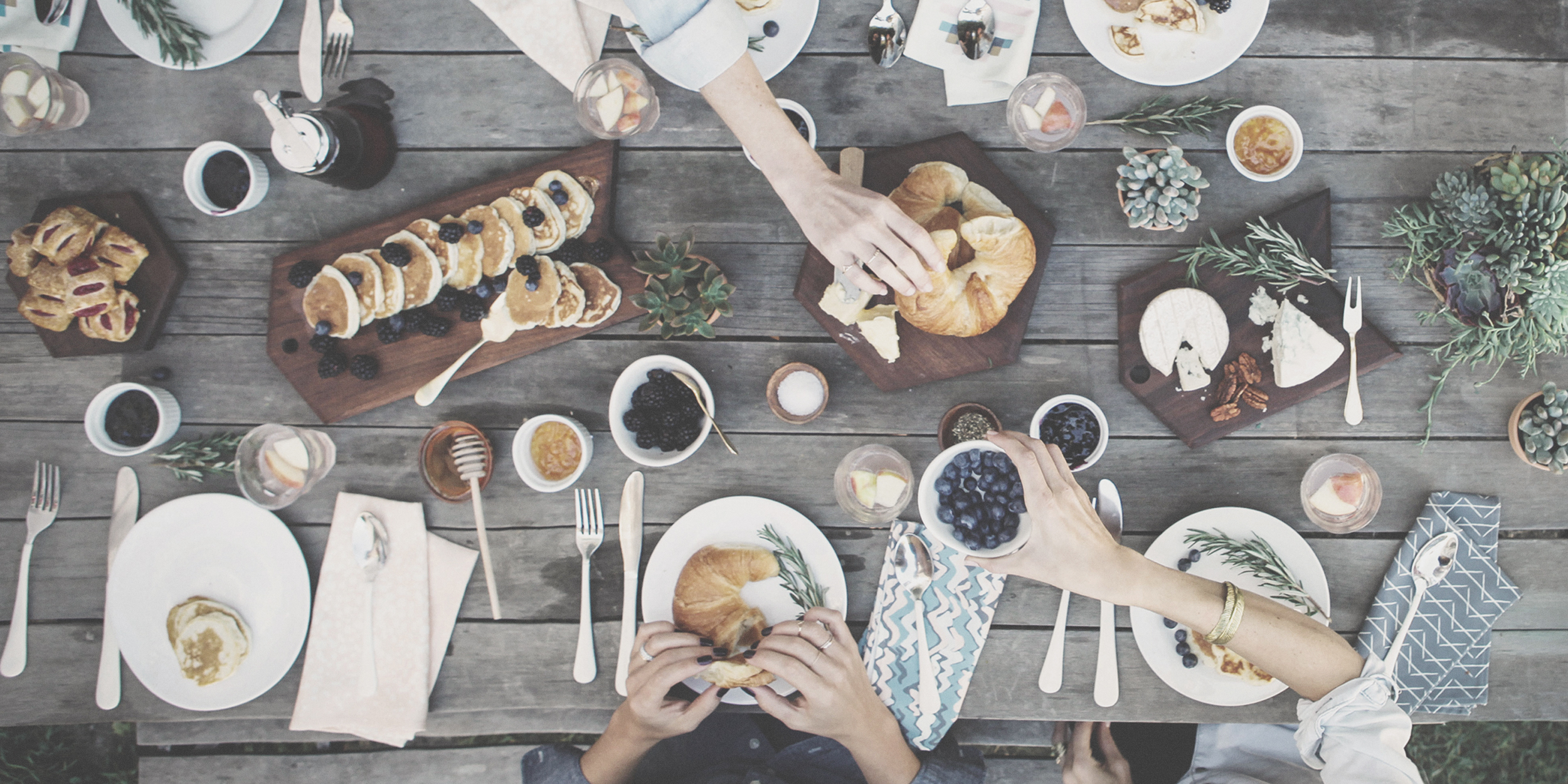
3 | GATHER PROPS
After the foundation was set for my brand, I could start pulling together all the props I needed to style my photos. Before I had steps 1 and 2 in place, I used to throw any old bunch of props together that I thought looked good. What looked good for one photo may not look good as a whole library. I could no longer include red objects and shabby chic white backdrops when my brand was clearly telling me it is blue tones with strong wood accents. Of course, I can definitely include white colors as that's a neutral that works with any color palette. I just had to be more selective about the type of white I was using.
4 | STORYTELLING THROUGH PROPS
Now that I found props in all the colors and style of my inspiration board, I went about creating mini stories out of those props. Since my niche is about photo styling with an emphasis on brand photography in the creative field, I could use any variety of props a creative person might use. This may not be the same for you if you specialize in food styling or wardrobe styling. As a food stylist, it may look out of place if you had photographs of throw pillows and fabrics. These items may be better suited for an interior stylist. Custom stock imagery should be fairly generic so you can use that photo for more than one purpose, but also be intentional so the props don't look like an afterthought.


5 | PHOTO SHOOT
I do all my own photography work, but not every stylist does. It takes more time to be the photographer as well as the stylist because you have to assess each image to see if anything needs to be tweaked. You are looking for dark spots and glares as well as whether that book would look better another inch over. I'll expand on the difference in roles between the stylist and photographer in a future post.
6 | PHOTO EDITING
I know of a lot of photographers who don't enjoy the photo editing process, but I actually love it. I get really excited to upload all the photos from my camera onto my laptop so I can review them. As I try to get all the lighting and styling right during the photo shoot, I usually don't have to do much editing to my photos. I often just brighten the images and add some clarity to them. I do, however, use the crop tool quite often.
At the end of this process, I have a library of roughly 25 custom stock photos I can use throughout my website or social media. I love that all my photos relate to one another and everything looks branded.